
Neutral living room decor is far more than a safe default, it’s a design philosophy that gives homeowners flexibility, longevity, and peace of mind. Whether you’re moving into a rental, planning a long-term refresh, or simply tired of trend-chasing, neutral palettes create a calm foundation that adapts to your evolving tastes and doesn’t look dated in five years. Unlike bold accent walls or statement pieces that can feel exhausting after a while, neutrals let your furniture, art, and personal touches take the spotlight. The key is layering warmth, texture, and light to prevent your space from feeling sterile or bland. This guide walks through seven concrete approaches to neutral living room design, from warm beiges to cool grays to strategic texture and lighting, so you can create a space that’s both inviting and timeless.
Table of Contents
ToggleKey Takeaways
- Neutral living room decor provides lasting design flexibility that won’t look dated, allowing your space to adapt as your tastes evolve without the exhaustion of trend-chasing.
- Layer varied textures—linen, wool, wood, rattan, and woven materials—across walls, furniture, and accessories to prevent monochromatic flatness and create visual depth within a neutral palette.
- Warm neutrals like beige and cream offer cozy, inviting atmospheres, while cool grays provide clean, contemporary simplicity; choose based on your home’s natural light and architectural style.
- Invest in quality, timeless neutral furniture pieces with solid construction and natural materials rather than cheap trend-driven items, ensuring your investment lasts longer than fast-fashion alternatives.
- Strategic lighting with warm color temperatures (2700K), layered fixtures, and natural light enhancement through lightweight window treatments brings ambiance and reveals texture in neutral spaces.
- Incorporate living plants, natural wood accents, and organic materials like stone and jute to introduce movement and warmth while maintaining the calm foundation of your neutral design.
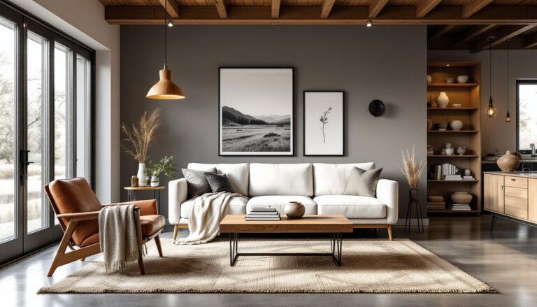
Warm Neutrals: Creating Cozy Spaces With Beige, Tan, and Cream
Warm neutrals, beige, tan, ivory, and cream, are the go-to choice for anyone wanting a living room that feels wrapped in a hug. These colors reflect light softly and pair beautifully with natural wood tones, making them especially effective in older homes or spaces with warm undertones in the flooring or trim.
Start by painting walls a soft greige (gray-beige hybrid) or warm cream to create an enveloping backdrop. These shades work particularly well if your room gets afternoon sun: they’ll glow rather than look dingy. When selecting paint, buy sample quarts and test them on your wall at different times of day, what looks perfect at noon might shift in evening light.
Pair warm wall colors with upholstered furniture in complementary creams or light taupes. A neutral sofa doesn’t have to be boring: look for pieces with interesting weaving patterns, linen textures, or subtle stitching details. Wooden furniture with medium to warm finishes, walnut, cherry, or honey oak, reinforces the cozy aesthetic without introducing competing colors.
Add warmth through textiles: wool area rugs in cream or oatmeal, linen throw pillows, and cotton blankets all feel tactile and inviting. Layer these textures rather than matching them exactly: slight variation in tone and fiber type creates visual interest. Accessorize with brass or brushed gold light fixtures and hardware: these metals naturally complement warm neutrals and add subtle glamour.
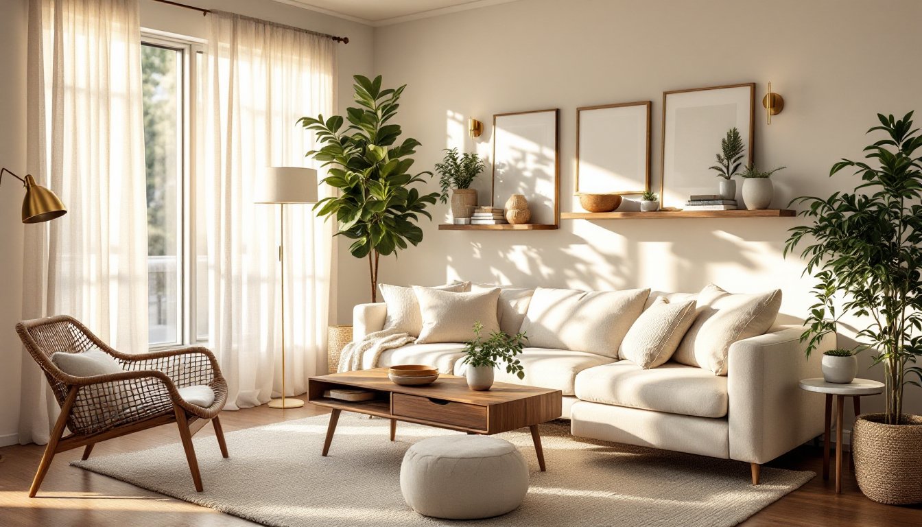
Cool Neutrals: Embrace Grays and Soft Whites for Modern Simplicity
Cool neutrals, soft grays, whites with blue undertones, and greige leaning cooler, create a clean, contemporary feel that works especially well in homes with modern architecture or lots of natural light. Unlike warm neutrals, cool grays won’t feel cozy: instead, they provide a quiet, minimalist backdrop that lets architectural details and carefully chosen pieces shine.
When painting, avoid stark whites, which can look clinical: instead, opt for off-white shades like white dove, cloud white, or gentle gray. Test samples because undertones vary wildly, some whites read slightly pink, others lean blue or yellow. The wrong white can feel cold or dated rather than fresh.
Furniture selection is crucial with cool neutrals. Look for pieces in soft grays, whites, or light taupe that won’t clash. Upholstery in linen or cotton blends works better than heavy velvet, which can feel dated. Metal accents should lean toward stainless steel, brushed nickel, or chrome rather than warm gold or brass.
Layers of texture become even more important in cool schemes because color alone won’t warm the space. Modern home decor trends show designers increasingly pairing cool grays with natural wood elements, plants, and woven textures to prevent sterility. A chunky knit throw, a sisal area rug, or stacked wooden shelves all introduce warmth and visual relief. Lighting should be warm-toned (2700K color temperature) to counterbalance the cool palette.
Layering Textures: Adding Depth Without Bold Colors
The most common mistake in neutral rooms is treating them as monochromatic, same tone, same fabric, no movement. Real depth comes from layering different textures, even within a limited color range. A room with varied textures feels curated and lived-in rather than flat or bland.
Start with your foundation: walls and large furniture. Then build texture through smaller pieces. A chunky linen sofa reads differently than a smooth velvet sectional, even if both are cream. Add a woven wool area rug, linen curtains, and cotton throw pillows with different weave patterns, some flat, some with subtle texture. Layer in natural wood side tables, a rattan accent chair, and woven wall baskets. Each texture catches light differently, creating visual depth.
Incorporate unexpected materials without breaking the neutral palette. A sheepskin throw, jute rug, macramé wall hanging, or stone tile accent all add tactile interest. Mix matte and glossy finishes: matte paint with polished hardwood, or a leather ottoman with linen curtains. The contrast keeps the eye engaged.
Interior design ideas emphasize that successful neutral rooms rely on texture as much as color. Don’t aim for sameness: aim for coherence. Every material should either complement or contrast intentionally. Avoid mixing too many competing weaves, two to three dominant textures (like linen, wood, and wool) plus one accent material works well. This approach prevents sensory overload while maximizing visual interest.
Neutral Furniture as Your Design Foundation
Neutral furniture serves as your canvas, it won’t fight with future decor updates or accent colors you might add later. The best approach is investing in solid, quality pieces in proven neutral tones rather than chasing cheap trend-aligned items that’ll feel stale in two years.
For sofas and sectionals, gray, beige, cream, and taupe are timeless choices. Opt for durable upholstery, linen blends, performance fabrics, or quality wool, over delicate silk or slick polyester. Sectionals work well in neutral schemes because their scale anchors a room: a large cream linen sectional feels grounded rather than overwhelming. Ensure the legs are finished wood (not plastic feet), which elevates the piece visually.
Neutral accent chairs, ottomans, and benches give flexibility. A wooden frame chair in linen, a leather ottoman, or a rattan accent chair all complement neutral walls while introducing textural variety. Storage pieces, credenzas, shelving, console tables, in warm or cool woods or painted white/gray tie the room together without adding color.
Tables matter. A solid wood coffee table in walnut or oak, or a marble-top metal-base table in chrome, both ground a neutral room. Avoid overly trendy designs or finishes that date quickly. Timeless shapes, simple rectangular, round, or square forms, work longer than geometric or sculptural silhouettes that peak and fade in popularity.
One practical note: neutral doesn’t mean expensive. Home styling guides show that budget-friendly neutral pieces from mid-range retailers often outlast trend-driven expensive items from high-end boutiques. Prioritize construction and material quality over brand names.
Bringing Life to Neutrals With Natural Elements
Neutral rooms benefit enormously from organic, living elements, plants, natural wood, stone, and natural fiber, that introduce movement, color variation, and life without breaking the neutral scheme.
Live plants are among the easiest solutions. Potted ferns, snake plants, or fiddle leaf figs in natural ceramic, terra cotta, or woven baskets add greenery and visual relief. Plants also improve air quality and create focal points without requiring paint or furniture swaps. Arrange them at varying heights, on the floor, shelving, plant stands, and windowsills, for dynamic layering.
Natural wood in furniture, shelving, or architectural details grounds a neutral room in warmth. Exposed wood beams, hardwood flooring, or wooden wall shelving all work. If your room lacks wood, introduce it through accent pieces: a wooden mirror frame, side table, or decorative bowls. Vary wood tones slightly, mixing walnut, oak, and honey-toned pieces creates richness rather than uniformity.
Stone and natural fiber reinforce organic warmth. A slate-topped side table, marble bookends, or natural stone tile accent wall (if you’re willing to DIY or hire help) add tactile authenticity. Woven baskets, jute rugs, rattan chairs, and wool throws all feel handmade and lived-in, preventing the sterile feeling that sometimes plagues all-neutral spaces.
Natural light through windows with minimal-frame curtains or Roman shades lets daylight animate the space. Avoid heavy, dark curtains in neutral rooms: instead, use linen or cotton in cream or light gray that filters light softly. This approach maximizes the interplay between natural elements and neutral tones.
Lighting Strategies That Enhance Neutral Palettes
Lighting makes or breaks a neutral room. Poor lighting flattens colors and kills ambiance: strategic lighting brings depth and warmth to neutral palettes that otherwise risk feeling dull.
Start with layered lighting: ambient (overhead or ceiling fixtures), task (reading lamps, desk lights), and accent (spotlights, wall sconces). In a neutral living room, overhead light alone is rarely enough. Add floor lamps with warm-toned shades, linen or paper in cream or light gray, and table lamps on side tables or consoles. Position lamps so light bounces off walls and textures rather than pointing directly at seating areas.
Choose warm color temperature (2700K) for incandescent or LED bulbs. This replicates natural candlelight and complements both warm and cool neutrals without appearing yellow or sickly. Dimmer switches are essential: they let you adjust ambiance from bright (daytime task work) to cozy (evening relaxation).
Natural light should be enhanced, not hidden. Sheer curtains, lightweight Roman shades, or no window coverings at all maximize daylight during the day. Morning and afternoon sun animates a neutral room, revealing texture in wood, linen, and woven pieces. If privacy is a concern, consider roller shades in light colors that block visibility from outside while diffusing light inward.
Accent lighting adds dimension. A wall sconce flanking artwork, shelf lighting highlighting textured décor, or a pendant light over a console all create visual layers. Fixtures in brushed brass, nickel, or matte black complement neutrals without competing. Avoid overly ornate or trendy fixtures that will feel dated: simple shapes in quality materials age well.
Conclusion
Neutral living room decor isn’t a compromise or a placeholder, it’s a deliberate design choice that yields flexibility, timelessness, and calm. By thoughtfully layering warm or cool neutrals, textures, natural elements, and strategic lighting, you create a space that works for your life now and adapts as your tastes evolve. The focus shifts from trending colors to quality materials, intentional choices, and personal touches that make the room genuinely yours.