
Choosing a paint color for your living room is one of the highest-impact decisions a homeowner can make, and one of the most reversible. A fresh coat of paint costs far less than replacing furniture or flooring, yet a well-chosen color can completely reshape how a space feels. The challenge isn’t lack of options: it’s navigating thousands of hues without ending up with “Millennial Pink Regret” or “Banker’s Gray Boredom.” This guide walks you through the main color strategies that work in 2026: neutrals for flexibility, moody tones for drama, airy pastels for calm, and accent walls for pinpoint impact. Whether you’re starting from scratch or refreshing a tired room, understanding how paint color behaves under different lighting and how it pairs with your existing décor sets you up for success.
Table of Contents
ToggleKey Takeaways
- Paint colors for living room walls can completely reshape how a space feels for a fraction of the cost of replacing furniture or flooring.
- Neutral tones like greige, warm whites, and soft grays provide a timeless foundation that works with nearly any décor, while testing large paint swatches for several days under different lighting ensures the right choice.
- Moody colors such as deep navy, forest green, and charcoal deliver sophisticated drama when paired with quality layered lighting and white or off-white trim to prevent claustrophobia.
- Soft pastels like pale sage green, dusty blue, and blush pink create serene, Instagram-friendly backdrops that work especially well in smaller spaces with limited natural light.
- An accent wall on a fireplace, shelving, or prominent wall offers a budget-friendly way to test bold paint colors before committing to an entire room.
Neutral Tones: The Timeless Foundation for Living Room Elegance
Neutral paint colors remain the safest long-term choice for living rooms, not because they’re boring, but because they work with nearly any furniture, art, and décor you add down the line. A true neutral reflects minimal color bias and pairs well with bold accents, vintage pieces, or minimalist setups without clashing.
Warm Neutrals and Cool Whites for Maximum Versatility
Warm neutrals include greige (a gray-beige hybrid), tan, cream, and warm white. These hues contain subtle hints of yellow, orange, or red undertones, making them feel inviting and less sterile than cool whites. Greige has become enormously popular because it bridges the gap: it feels neutral but with enough warmth to avoid the clinical feel of pure gray.
Cool whites and soft grays (like dove gray, charcoal-tinged whites, and soft cool gray) work beautifully in rooms with northern or eastern light exposure. They enhance brightness without the yellow cast that warm paints can introduce in dim rooms. The trick is testing samples on all four walls and observing them at different times of day, morning, afternoon, and evening lighting will shift how a color reads.
When selecting a neutral, avoid the temptation to grab whatever’s on display at the paint counter. Purchase sample pints ($5–10 each) and paint large swatches (at least 2 feet by 2 feet) on your walls. Live with them for a few days. Paint color looks drastically different under artificial lighting versus daylight, and what looks perfect in the store will feel wrong under your specific ceiling fixtures and window orientation.
According to recent living room paint color ideas from designers, soft neutrals and warm grays rank at the top for rooms that photograph well and feel timeless. Pair warm neutrals with brass or gold hardware and wood accents: pair cool whites with chrome, stainless, or black matte fixtures for a modern edge.
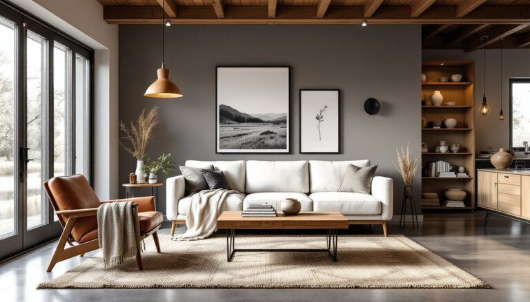
Bold and Moody Colors: Making a Statement With Your Walls
If your living room gets consistent natural light and you want personality, moody colors deliver drama without the dated feel of 1990s dark paint trends. Modern moody palettes, think deep navy, forest green, charcoal, and slate blue, feel sophisticated when paired with quality lighting and the right trim.
Deep Blues, Greens, and Charcoal for Sophisticated Depth
Deep blues work exceptionally well in living rooms because they recede visually, making a space feel larger and more restful. Navy blue, in particular, pairs well with warm wood tones, cream trim, and brass fixtures. Forest green creates an almost spa-like calm and works especially well if your room has tall windows or good overhead lighting. Charcoal and slate tones add urban elegance but require careful lighting planning, these colors can feel oppressive in rooms with poor natural light or dim artificial lighting.
The critical mistake homeowners make with bold colors is underestimating the visual weight they carry. A living room painted in deep charcoal at 9 p.m. under standard recessed lights will feel completely different from how it appears at noon on a sunny Saturday. Before committing, paint two full walls (not just swatches) and spend an entire day and evening in the room observing how the color shifts.
Bold colors also benefit from strategic trim. Painting your trim, ceiling, and molding in white or off-white creates visual breathing room and prevents the walls from feeling claustrophobic. Matte or eggshell finishes on bold walls reduce shine, which helps the color feel intentional rather than plastic.
Lighting becomes non-negotiable with moody colors. You’ll want a combination of ambient overhead lighting (dimmer-controlled if possible), task lighting (floor lamps or wall sconces), and accent lighting (wall-wash lights or cove lighting above molding). These layers let you adjust the mood throughout the day. Interior design inspiration across multiple room types frequently showcases moody colors paired with layered, warm lighting for an inviting effect rather than a cave-like atmosphere.
Light and Airy Pastels: Creating Calm and Openness
Soft pastels, pale sage green, dusty blue, soft pink, warm cream, and gentle yellow, create a serene backdrop without the bland feel of pure white. These colors work especially well in smaller living rooms or spaces with limited natural light, as they reflect light while adding subtle personality.
Warm Whites and Soft Grays That Brighten Any Room
Pale pastels sit on the border between white and color, giving you flexibility without the risk of a bold statement. Soft sage and dusty blue have exploded in popularity over the past two years and work in both traditional and contemporary settings. Pale pink tones (think blush or rose quartz) feel modern when paired with minimalist furniture and matte finishes rather than the “little girl’s room” pink of decades past. Warm creams and ivory tones add depth to white without the yellow undertones that can age a space.
The advantage of pastels is their forgiving nature. If you’re uncertain about color commitment, a soft pastel lets you test the waters without the drama of navy or the staleness of pure white. These colors also photograph well for social media, they’re Instagram-friendly without feeling fake.
Application tip: pastels show imperfections more than darker colors, so invest time in wall prep. Fill nail holes, sand glossy areas, and apply a quality primer (especially if painting over bold or dark colors). Two coats of paint are often necessary with light colors to avoid blotchy coverage. A satin or eggshell finish works better than flat for pastels, as flat paint can look chalky in low light.
Pastels pair beautifully with natural wood, rattan, and linen textures, think woven baskets, wooden side tables, and soft furniture. These materials add warmth that prevents the room from feeling cold or sterile. Popular design sites like Young House Love’s DIY and paint tutorials frequently feature soft pastels as a gateway color for homeowners nervous about painting.
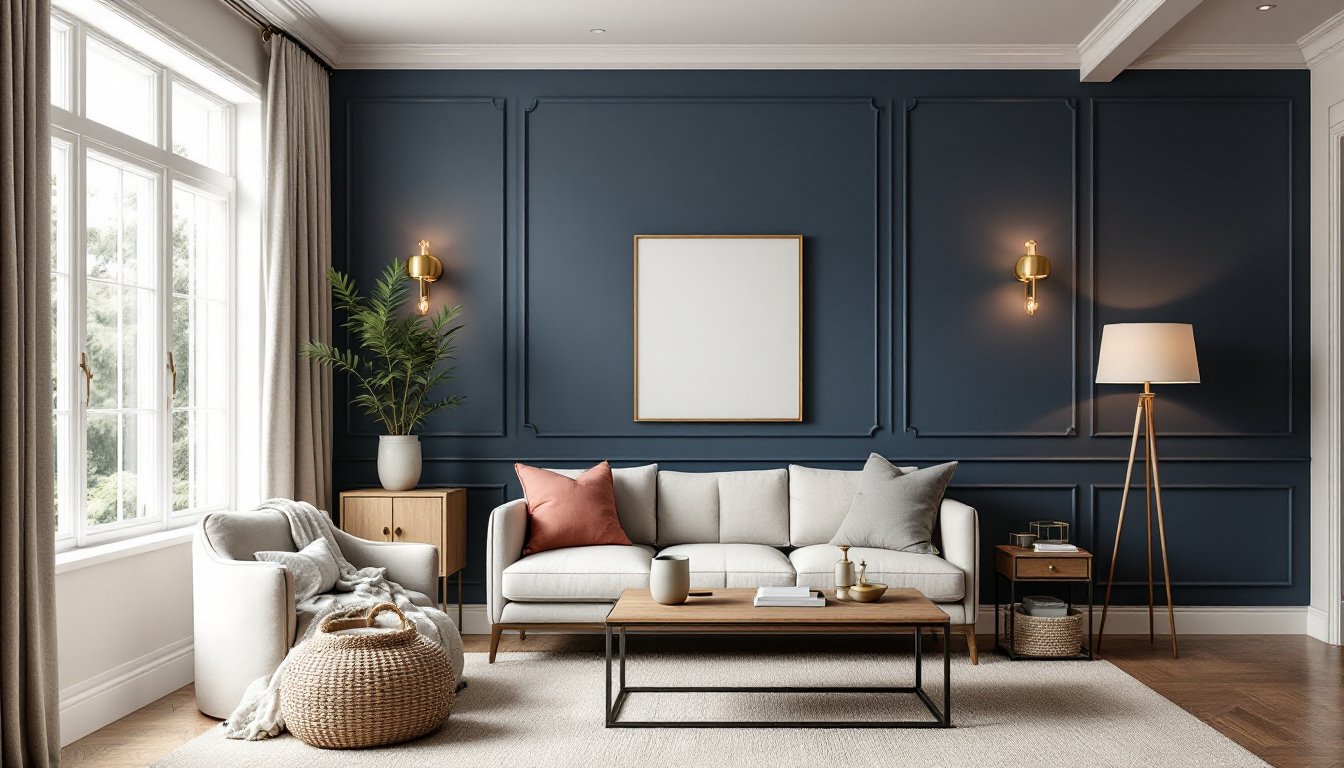
Accent Walls: Strategic Color Placement for Visual Impact
An accent wall, one wall painted a different color than the other three, adds visual interest without overwhelming a room. The key is choosing which wall and which color combination.
The wall to paint: Choose the wall you see first when entering the room, or the wall opposite the main seating. Avoid painting the wall behind the TV or sofa if that wall contains no architectural interest. Fireplace walls, walls with built-in shelving, or walls with a large window work beautifully as accent walls.
Color strategy: An accent wall should contrast noticeably with the other three walls. If your three walls are neutral (warm white, greige), your accent can be bold (deep blue, forest green, charcoal). If your three walls are already moody, your accent should be lighter or warmer. The rule of thumb: choose a color that’s at least 3–4 shades darker or lighter than your main walls, or a distinctly different hue altogether.
Practical considerations: Accent walls require precise trim work along the top, bottom, and corners. If your room has crown molding, architectural details, or built-ins, edge your accent color cleanly with painter’s tape (applied firmly and removed while the paint is still tacky for crisp lines). Budget extra time for taping, rushing this step ruins the finished look.
One accent wall costs roughly one-quarter of the paint expense of painting the entire room, making it a budget-friendly way to test bold colors before committing. Many homeowners start with one accent wall, live with it for a season, and then decide whether to expand the color or stay with the mixed approach.
Lighting on accent walls: A bold accent wall shows all its depth and richness with proper lighting. A wall-mounted sconce, picture light, or strategically placed floor lamp will bring out the color’s nuances and prevent it from reading as flat or dull in the evening.